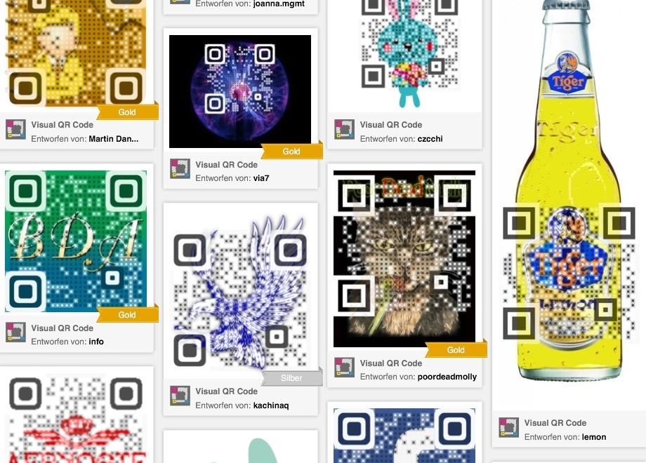
You may be enthusiastic about what you offer and you may be creative, when it comes to marketing your (social) enterprise. Multimedia elements such as pictures, QR codes and videos – used correctly – can be very helpful. Pictures and videos say often more than thousand words – in a positive, but also in a negative way. If you do not care about these eye-catching elements, but just put them for making it ‘colourful’ they send out a wrong message. And all your interesting work and text information might be destroyed. Just because no one continues reading if the first impression gets wrong.
Here a four mistakes you should avoid:
1. Attractivness
Think about the people who will see your pictures and videos. Everyone loves interesting images, which show some eye catching details, surprise, make think and raise curiosity. The famous handshake of two businessmen might be the wrong choice in a social context. You should lure visitors/readers, but the allure should be appropriate. Which impression do you transfer in the first seconds presenting these pictures? The visitor, reader or dialogue partner characterizes visuals from an emotional standpoint before he/she is going to analyze it. And decides immediately whether it is attractive or not.
2. Context
Do your images explain and show the topic in a unique way? Are they entertaining or an additional information to what you are going to tell? The worst are pictures which do not fit to the context and can easily be substituted by many others. The number of videos/images should be in the right balance with your text elements. A brochure full of text and no eye- attracting element, a presentation with more than five bullet points or a picture overload where your visitor/reader needs just a simple contact is simply horrible. Or do you like this way of overloaded, boring presentation?
3. Quality
Forget about videos with a bad quality. It is better to re-do, if the quality is bad. Shorten, where possible. A good video today is about 3 to 5 minutes max. It is better to have more short videos on your site dedicated to clear information pieces than one long video. Give your visitor a choice to select what they want to see. Otherwise you will loose them after a few minutes.
If you want to refer to videos on a brochure or poster, use QR codes. Why not using the really attractive colored or designed ones? The more attractive these QR codes are done the more people will scan them for finding out what is behind.
4. Functionality
If visitors can’t get the information they need, your website, presentation or print material is useless.
Also if you use the latest tools and most modern programming software. A nice technology is attractive – without doubt – but not essential. Because materials of for-profit enterprises often are more elaborate than startup/smaller non profit ones, often they offer more decent functionality. But it is not the most sexy functionality that makes it really a success. Good content and an attractive appearance are better than the newest video player in a green blinks button area. However, if you integrate videos and QR codes, ensure that they work!
Tip
Looking for some good QR code designs and some details on how to get them?
http://blog.kissmetrics.com/genius-qr-codes/
Or just search for QR code design images on your browser. There are free visual QRCode generators available in the Internet.
Picture (shown above) source: http://www.visualead.com/deu/
